

Why Are Packaging Labels the First Touchpoint Between Brands and Consumers?
2026-09-04
A consumer walking down a grocery aisle is not reading. They are scanning. The average shopper passes 400 to 500 products per minute in a supermarket. That is less than one second per product. In this environment, the Packaging Label is not just a source of information. It is the only chance a brand has to interrupt the scan and convert it into a decision. The label is the first thing the consumer sees, the first thing they touch, and often the only thing they remember after they leave the store. This guide is written for brand managers and marketing directors who understand that the label is not an afterthought—it is the product.
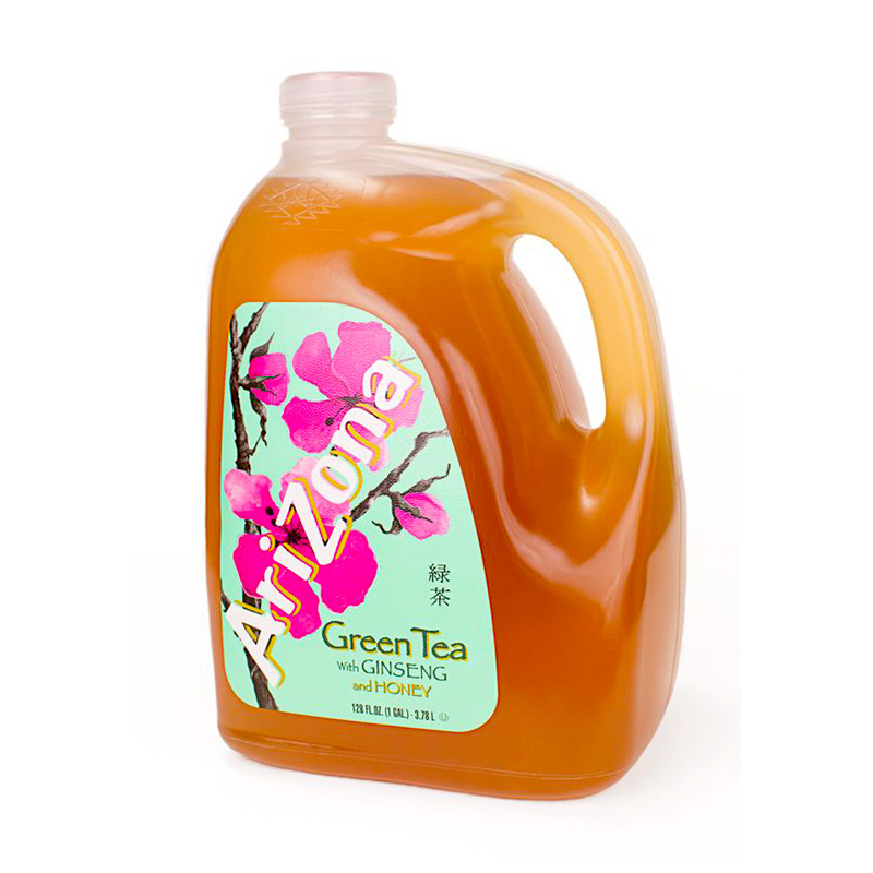
1. What Happens in the First 3 Seconds of Consumer Exposure?
Visual processing research shows that consumers make a preliminary judgment about a product within 100 to 300 milliseconds of exposure. That is before they have time to read any text. The brain processes color, shape, and contrast first. The Packaging Label communicates three things in that instant: category relevance (is this what I am looking for?), quality expectation (does this look premium or cheap?), and brand recognition (have I seen this before?). In our factory, we have analyzed Packaging Labels that performed well in shelf tests. The common factor is strong contrast between the brand name and the background, a clear visual hierarchy, and a color palette that is associated with the product category. The table below shows the visual processing sequence and the corresponding label design elements.
| Processing stage | Time elapsed | What the brain processes | Corresponding label element |
| Pre-attentive processing | 100 – 200 ms | Color, contrast, shape | Background color, brand mark shape |
| Focal attention | 200 – 500 ms | Brand name, primary graphic | Font size of brand name, hero image |
| Recognition | 500 ms – 2 seconds | Category cues, quality signals | Product descriptor, foil stamping |
| Decision | 2 – 5 seconds | Differentiation, value perception | Callouts (organic, premium), pricing |
The implication is clear: the label must be designed for the scan, not the read. A brand that uses small fonts, low contrast colors, or cluttered layouts is losing the majority of potential buyers before they have even consciously looked at the product. In our factory, we produce Packaging Labels with high-definition printing that maintains sharp contrast even at small font sizes, ensuring the brand message is legible at a glance.
2. How Does the Label Build or Break Brand Trust Before Purchase?
Consumers have been conditioned to look for certain signals on a Packaging Label: certification marks (organic, fair trade, non-GMO), ingredient clarity, and nutritional information. These elements do not just provide information. They provide reassurance. A label that is difficult to read, has poor print quality, or contains spelling errors signals carelessness. In a consumer study conducted across multiple product categories, 67 percent of respondents said they would not purchase a product with a label that appeared faded or poorly printed. The table below shows the specific attributes that consumers associate with trust in a label.
| Label attribute | Consumer perception | Trust impact |
| Clean, legible font | Professional, transparent | High positive impact |
| Consistent color reproduction | Brand has quality control | Moderate positive impact |
| Accurate nutritional information | Brand is honest | High positive impact |
| Clear expiration date | Product is safe | High positive impact |
| Faded or scratched print | Old stock, poor quality | High negative impact |
| Missing required information | Brand is hiding something | High negative impact |
At Guang Dong-Hong Kong (GZ) Smart Printing Co., LTD., we manufacture Packaging Labels using UV-resistant inks that maintain color fidelity for the entire shelf life of the product. Our factory uses a color management system that matches Pantone colors across all print runs, ensuring that the brand color is consistent whether it is the first or the thousandth batch.
3. How Does Label Material and Finish Affect the Tactile Experience?
In the moments before purchase, the consumer does not just see the label. They touch it. The tactile experience of a label—the smoothness of a glossy finish, the texture of a matte or paper label, the weight of a premium stock—communicates something about the product quality. A beverage label on a premium craft soda might use a textured paper stock to suggest artisanal quality. A cosmetics label on a luxury product might use a metallic foil to suggest sophistication. In our factory, we offer a range of label materials and finishes: gloss and matte films, synthetic papers, clear labels, and metallic foils. We also offer a soft-touch lamination that gives a velvety feel. This tactile element is often overlooked by brand managers, but in a blind test we conducted, consumers consistently ranked products with premium-feel labels as higher quality, even when the product inside was identical.
Material selection tip: Consider the product's use environment. A frozen food label needs to be moisture-resistant and adhesive that holds at low temperatures. A bathroom product label needs to withstand humidity. Our factory provides a material selection guide that matches label materials to application conditions. We also offer sample kits so brand managers can feel and test different materials before making a decision.
Guang Dong-Hong Kong (GZ) Smart Printing Co., LTD. produces Packaging Labels with a wide variety of material and finish combinations. We test every label for adhesion, abrasion resistance, and color fastness before it leaves the factory.
4. How Does Label Design Influence the Path to Repurchase?
The first purchase is driven by shelf impact. The second purchase is driven by recognition. A label that is visually distinctive and consistent across product variants makes the brand easy to find on the shelf. This is why many brands use a consistent shape, layout, or color block across their entire product range. The label is the visual anchor that guides the consumer back to the brand. In our factory, we have seen that brands with strong label recognition achieve up to 40 percent higher repurchase rates in the same category. The label also serves as a reference point for online reviews and word of mouth. When consumers share a product photo, the label is visible and becomes part of the social media marketing. This means that the Packaging Label is not just a point of sale tool—it is a marketing asset that continues to work after the purchase.
Frequently Asked Questions About Packaging Label Strategy
Summary for Brand Managers and Packaging Decision Makers
The Packaging Label is the first and often the only direct communication between a brand and a consumer at the point of sale. It must work visually in under a second, provide the necessary regulatory information, reinforce brand trust, and guide the consumer to repurchase. The strategic decision around label material, print quality, and design clarity is not a manufacturing detail—it is a brand investment. Our factory has worked with brands across food, beverage, beauty, and industrial sectors to produce labels that perform on the shelf and in the hand.
Guang Dong-Hong Kong (GZ) Smart Printing Co., LTD. manufactures Packaging Labels with digital and flexographic printing capabilities. We provide design consultation, material selection, and print quality verification as part of our service. Each label is inspected for color accuracy and print clarity before shipment.